Madison Square Garden MSG+
2023
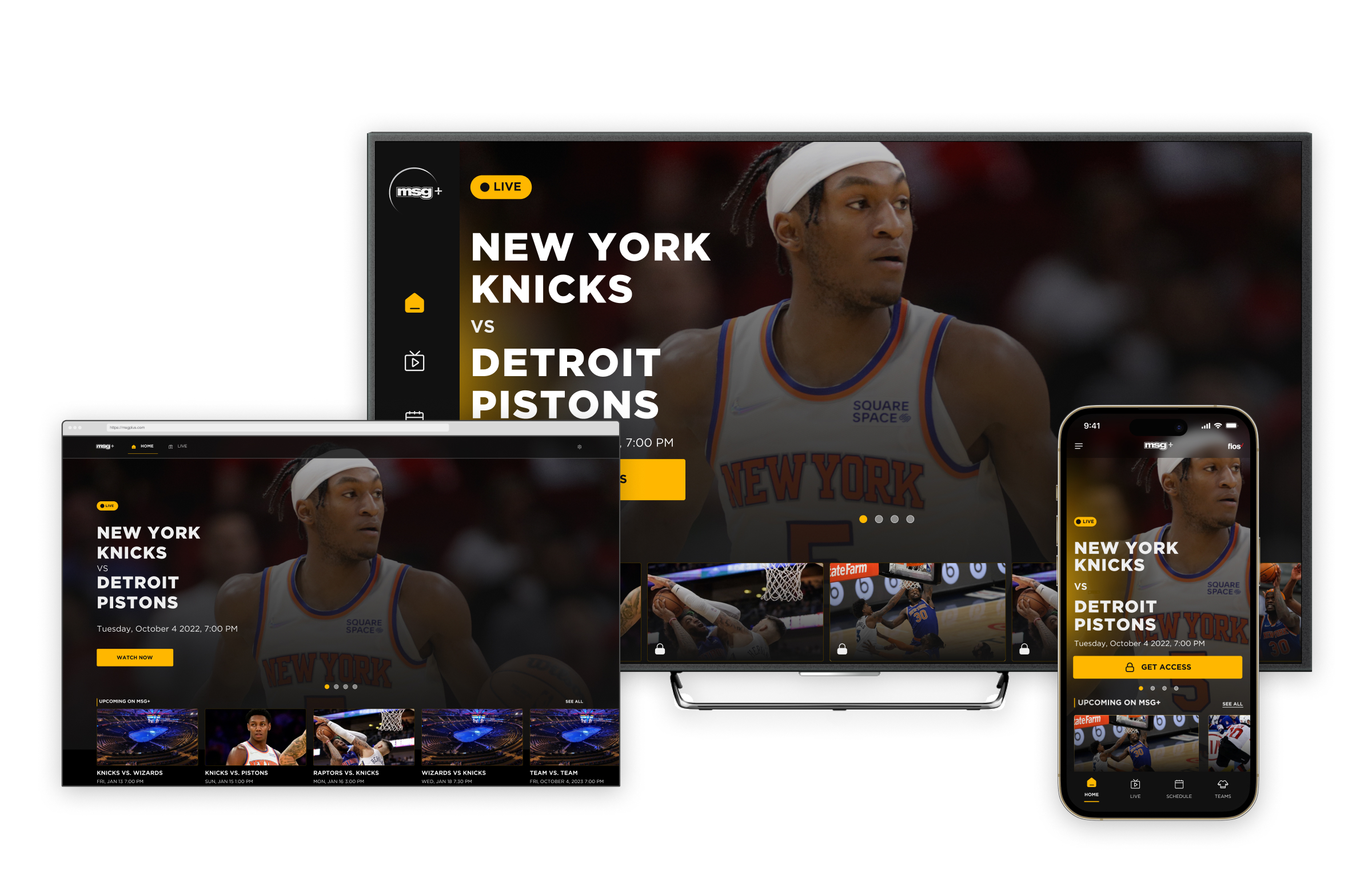
Designing a multi-platform, sporting event streaming service for 'The world's most famous arena'.
Impact
Fresh Ventures
A fundamental shift, from broadcasting to digital products as well as an assumption driven mindset embedded into the digital team.
Zero to One
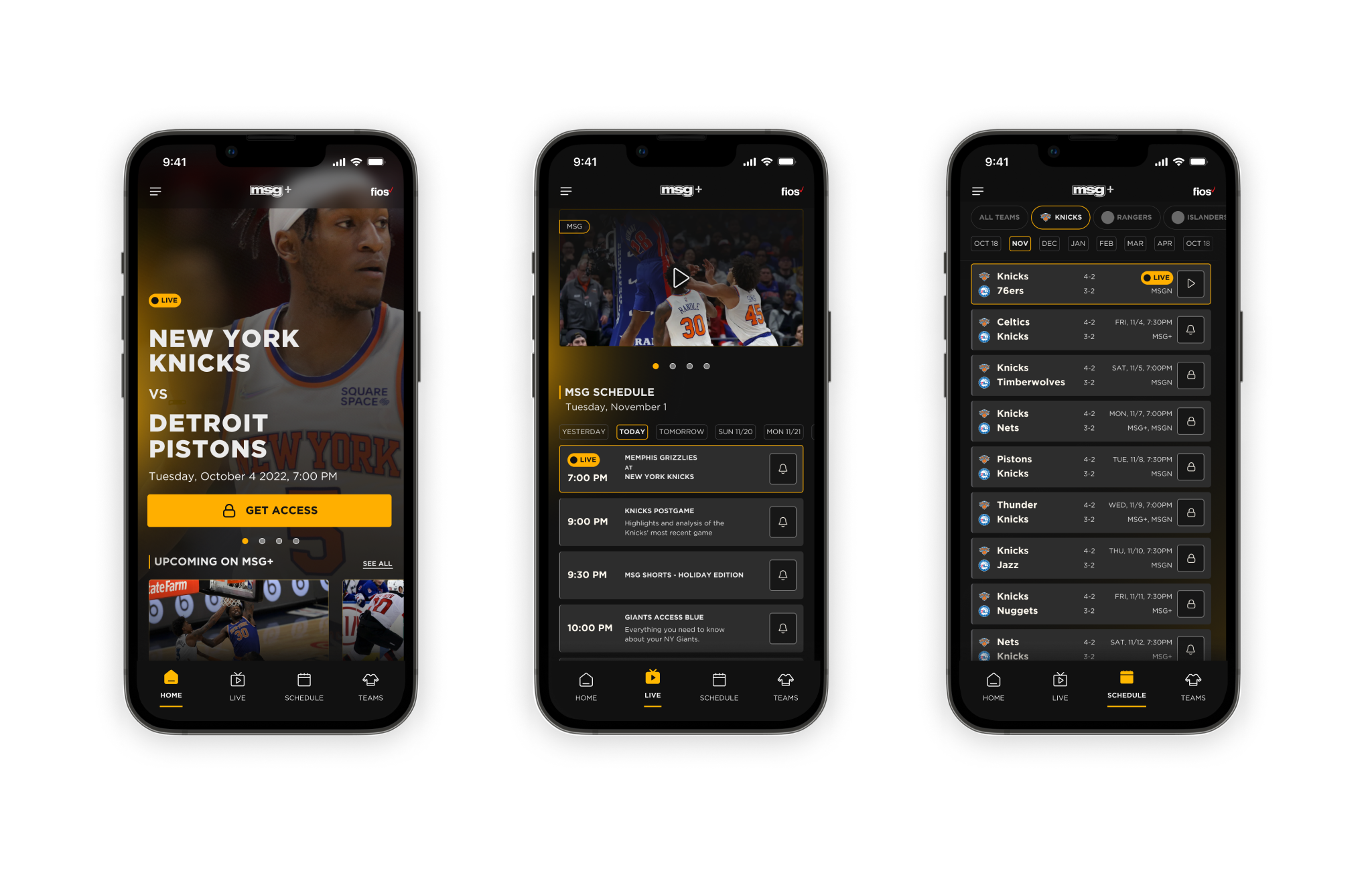
Launch of the first multi-device streaming service.
3.5*
A rating of 3.5 stars (1700+ reviews) on the Apple App Store.
Context
MSG Network (MSGN) is a regional cable network in New York City with a programming focus on sporting teams from New York State.'The Garden', as the landmark arena is known, is home venue to the New York Knicks and the NY Rangers and it also hosts games for the NY Islanders, New Jersey Devils and Buffalo Sabres.
MSGN telecasts live games and team related content for the above teams, as well as the NY Giants and Buffalo Bills.
Traditionally, games and sport related programming would be telecast over four MSGN run channels.
What was the problem?
By early 2022, VoC teams had cited a few assumptions that were impacting user satisfaction.Increasing rate of 'cord-cutting'

Cost conscious customers were exploring options with alternative sport networks in an effort to reduce the number of channels they subscribe to.
Deteriorating product market fit
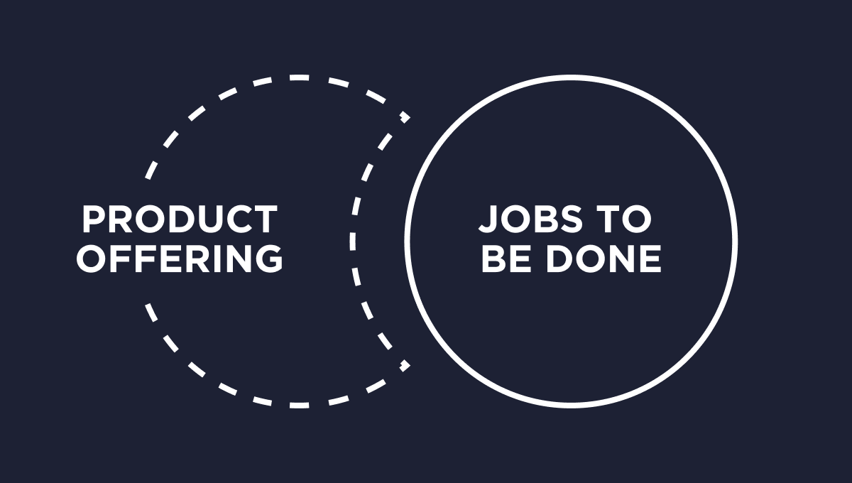
Users expected an on-demand viewing experience to suit their time poor lifestyles, not a broadcast.
Evolving user expectations

Most users wanted their viewing experience to be across the platforms and devices they owned, not just restricted to a TV.
Existing programming content

Younger users wanted formats of programming that they could consume with a shorter time and monetary commitment.
MSGN were keen on delivering a unified experience to their customers across all touchpoints and this would be the first time they would build service delivery products of their own.
What did I do?
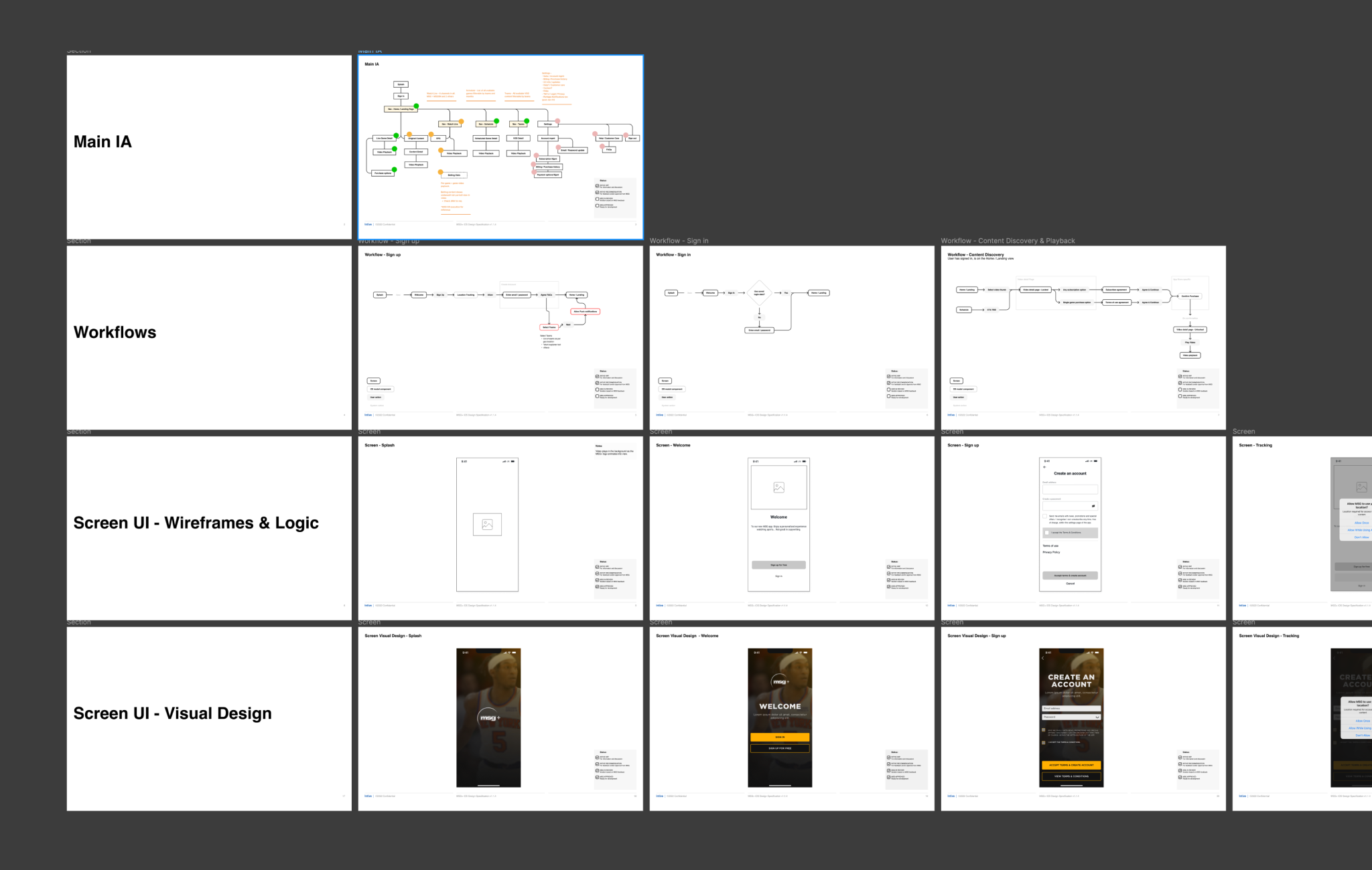
Over a course of a year, I worked closely with the executive and product leadership to define our approach to product-market-fit, product delivery strategy, key feature set, product look & feel and the interaction design across all key flows and platforms.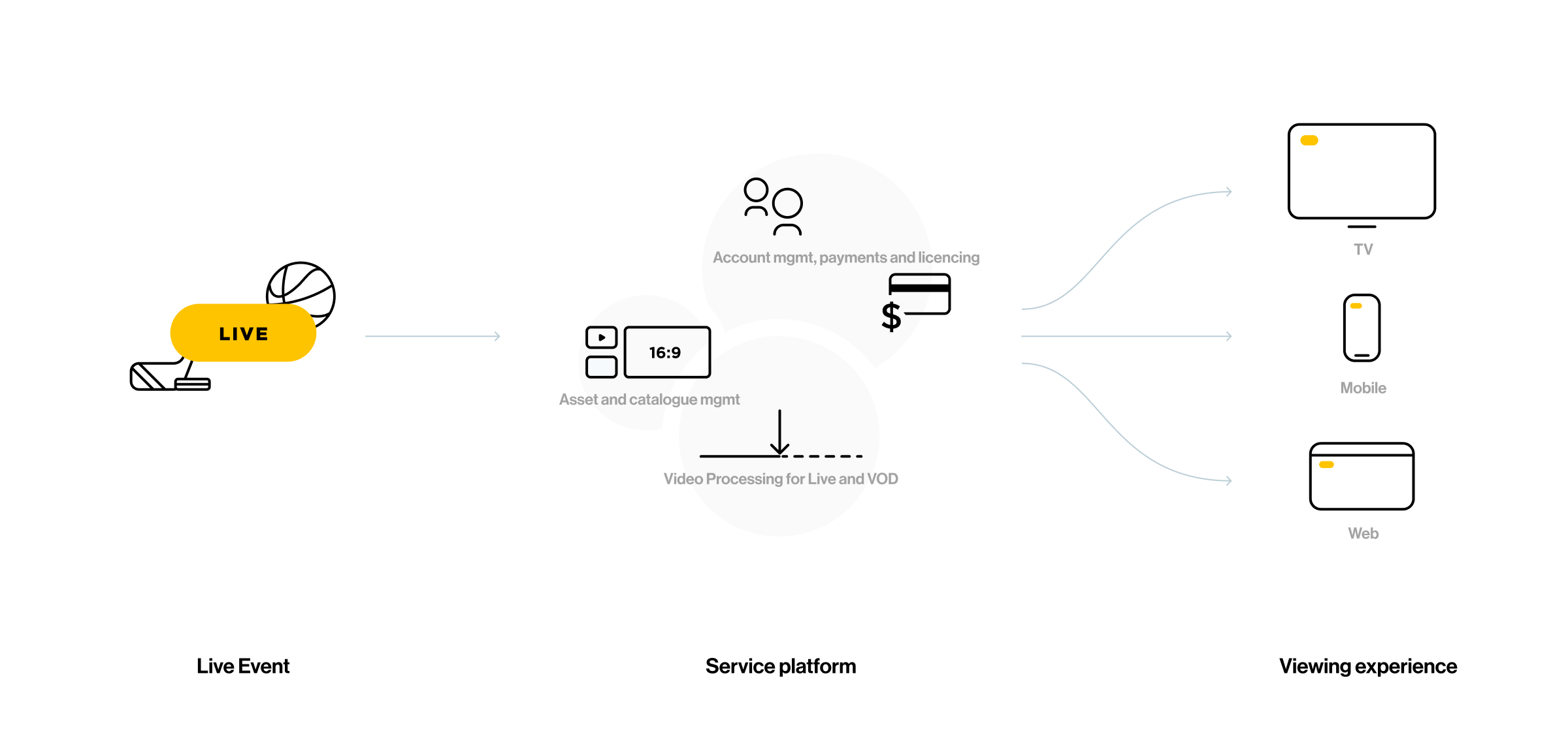
Unpacking the problem
At the start, a set of discovery workshop and 1:1 interviews with key stakeholders surfaced the business outcomes and product goals and key milestones for the project.
Discovery workshops, business goals and user insights
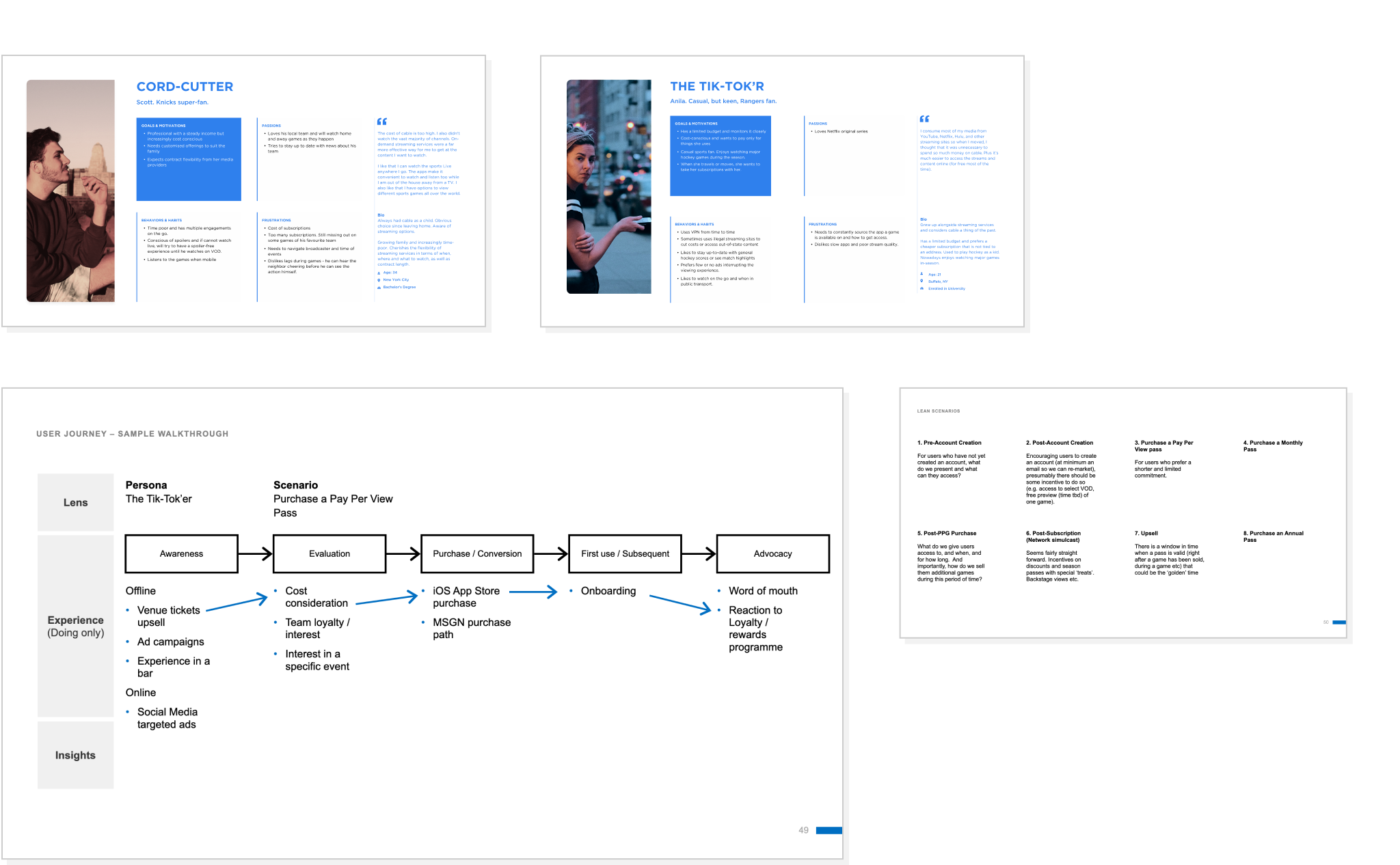
Further user research, competitor reviews and internal system reviews helped refine the target personas, scenarios, key user journeys and flows.
Creating the product
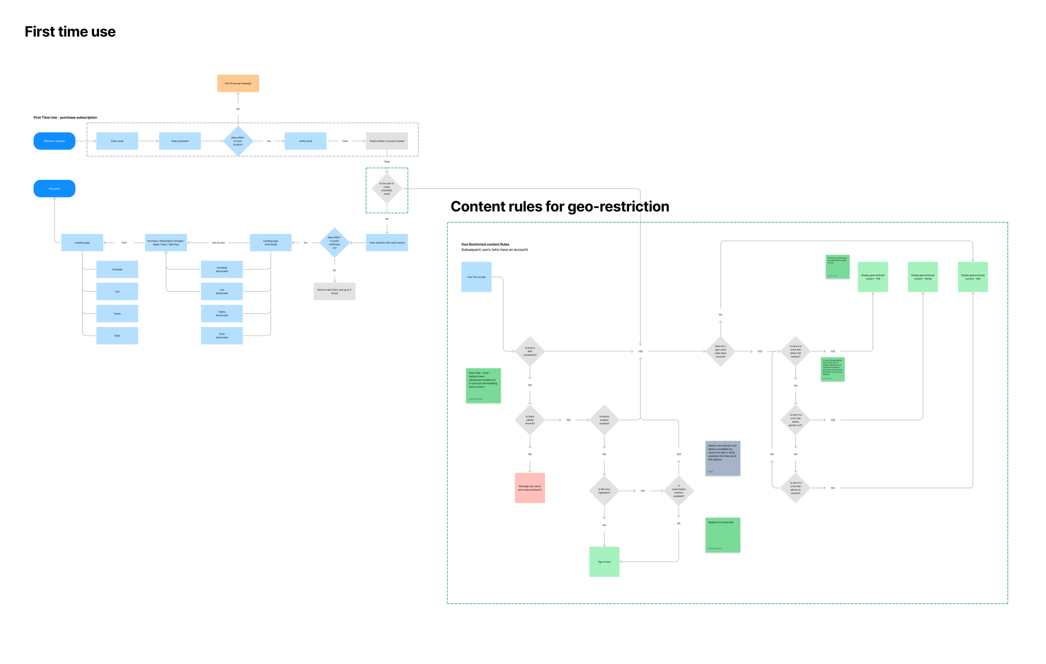
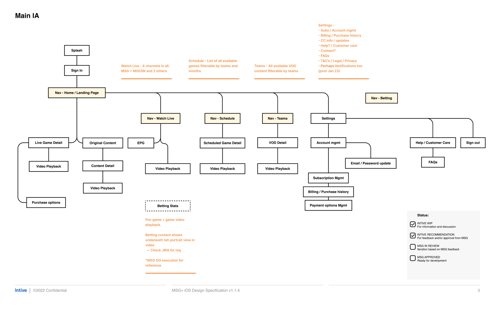
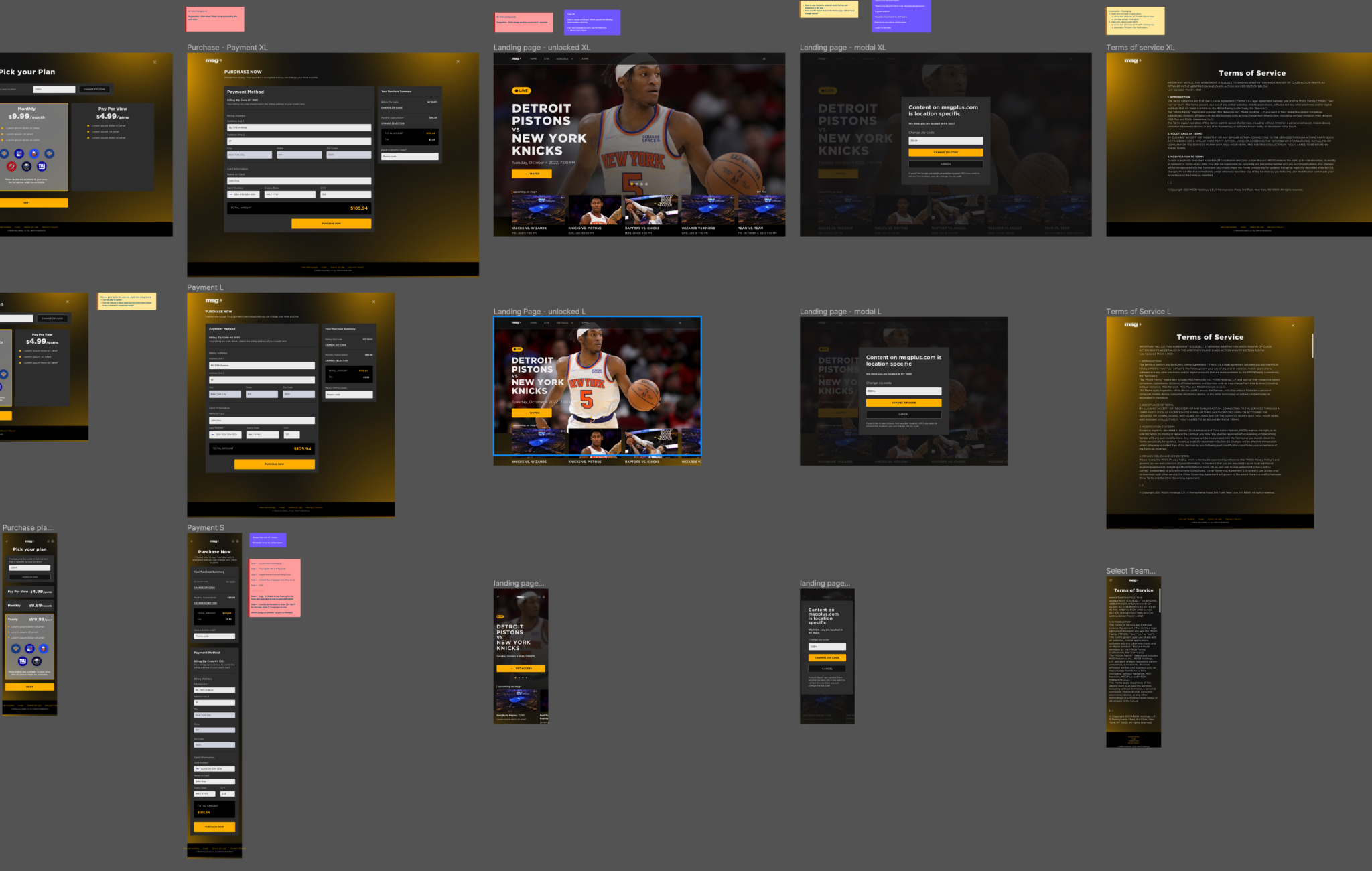
A governing principle of the product was that content was geo-restricted to New York state. There were some exceptions however. Content could be delivered for a limited amount of time, depending on when and where it was purchased.Unifying this service principle with an IA across all devices was an interesting challenge.
Mobile first
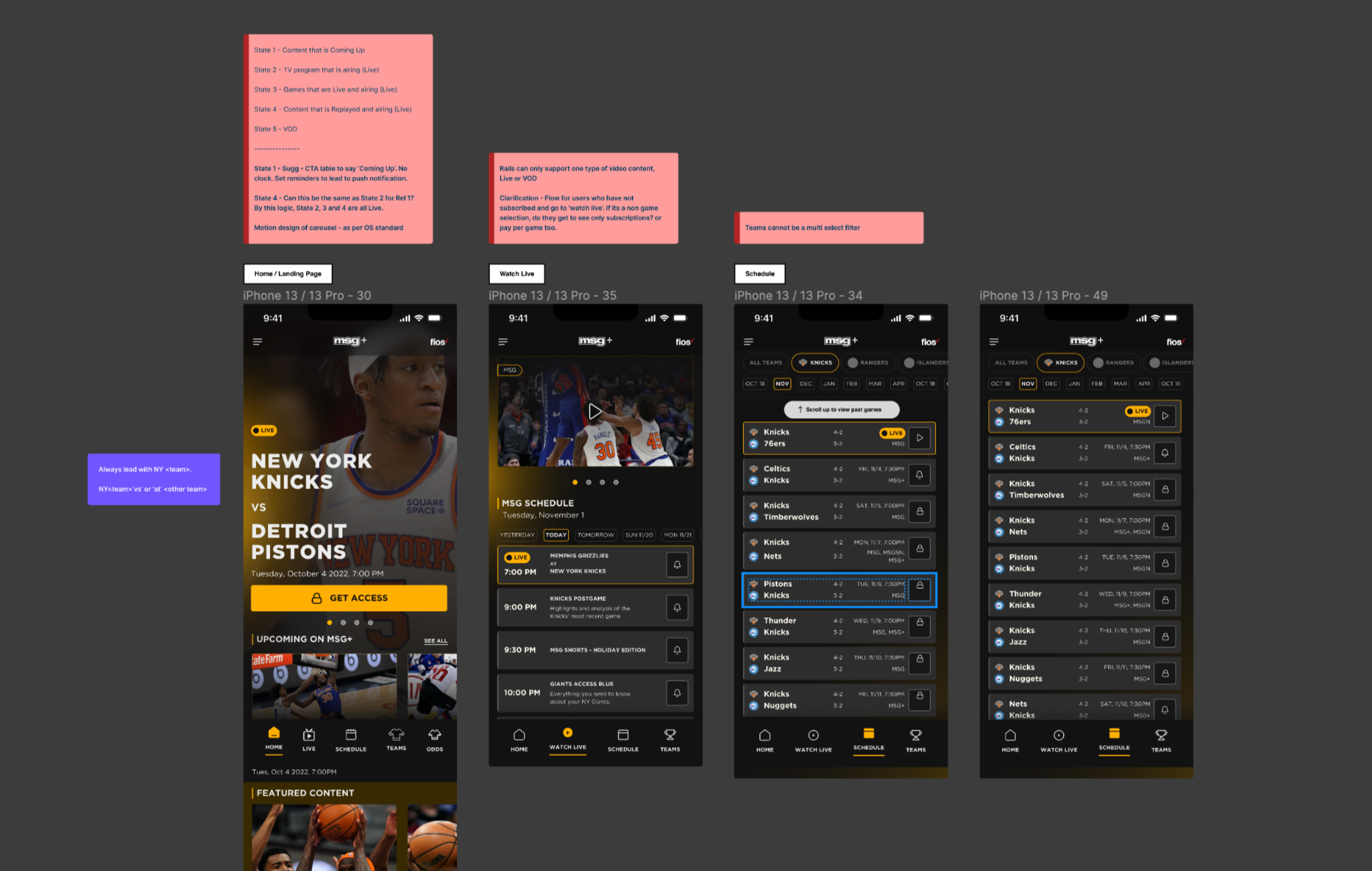
We had a 12 week window to deliver the MVP for all platforms. A challenging timeline but close collaboration with the executive team worked in our favour.One of the choices early on was to be content/mobile first and scale from there. This strategy helped in focussing the feature set and we were able to design for the web and native platforms in tandem.
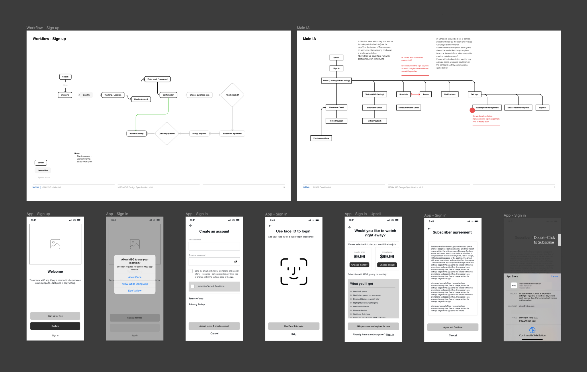
We rapidly iterated on the look & feel and branding. The move from wires/block frames in favour of hi-fidelity prototyping was a choice that helped us move at pace. This also resulted in robust collateral that we could test with users as well as with stakeholders.
Figma prototype of the release candidate
Origami prototype of a micro-interaction experiment
Reflections
An ambitious scope in a challenging timeline along with a great team. I would happily do this again, with some changes, mainly operational.This entire project was conducted remotely and with multiple stakeholders and integration partners. This required more intense discipline with documentation and communication but it paid off in the end.
Stakeholders too came with non-uniform understanding and appreciation of design. The communication of the design and how it would meet business goals, was a challenge and post release assessment still has to be conducted.
