London Stock Exchange Group Refinitiv Workspace
2021
Design for the Migration, Onboarding, Help & Support and Learning experiences as well as redesign of the core product framework.
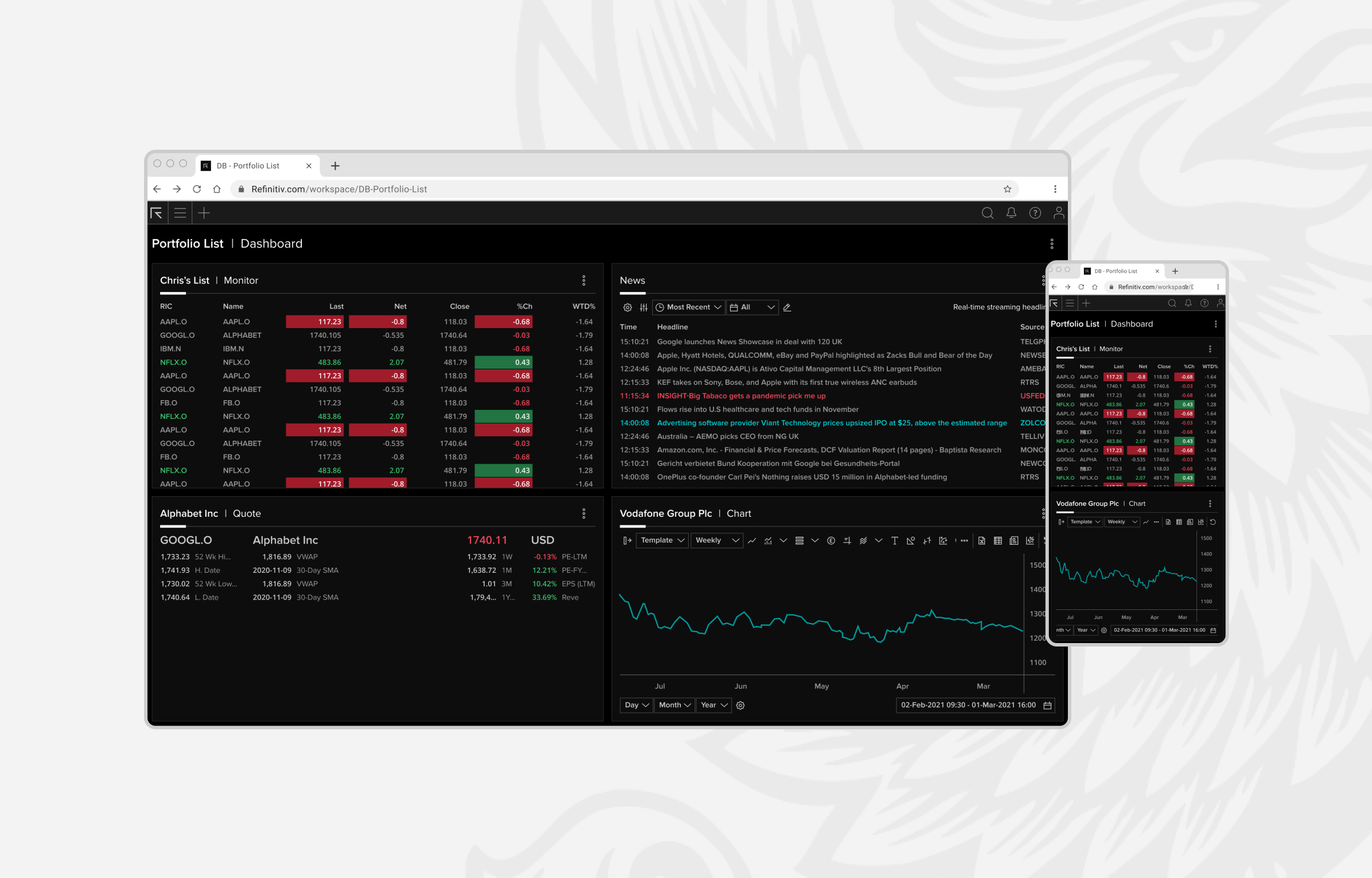
Impact
User satisfaction
Marked user satisfaction with reduced content redundancy and need for customer support. High satisfaction signals towards improved learnability and task completion.
60%
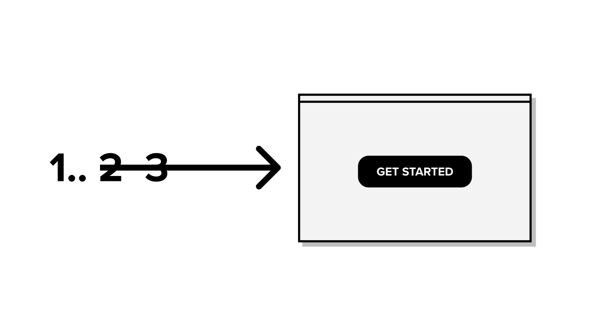
Reduction in onboarding steps. Overall, the steps reduced from approximately 25 to 8.
85%
Reduction in unit interaction cost.
Context
In 2018, a key business goal was to migrate users from Eikon to Refinitiv Workspace (RW).An early version of RW was released to select users and it was improved in many ways, but users reported challenges with system setup and were confused by some of the new controls.
The problem
Users and CSMs reported challenges that could be loosely stated as below.1
Its hard to setup.
Requires dedicated human support
Fear of losing data in transfer
Layouts need to be remade
Fear of losing data in transfer
Layouts need to be remade
2
Its hard to use.
Unclear necessity to upgrade
Unclear improvements to the system
Confusing controls
Unclear improvements to the system
Confusing controls
Instinctively, these problems appeared to be orientation challenges but to understand the exact nature of these challenges, I planned and conducted a research study with end-users and Customer Success Managers (CSMs).
Research themes
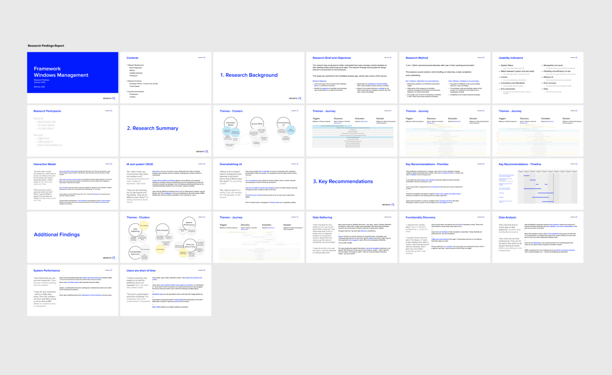
Research report
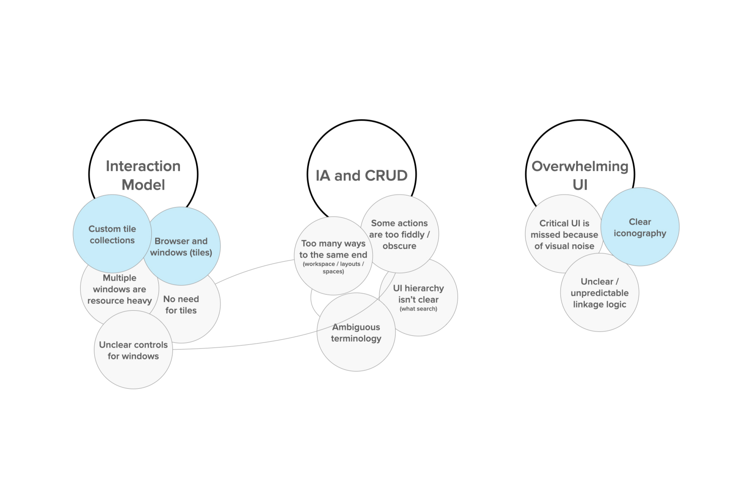
Top level findings
The feedback I collected was in two sets, to match the problems our users faced.
The first order findings were focussed on the long term problems we wanted to solve with the usability of the product.
The first order findings were focussed on the long term problems we wanted to solve with the usability of the product.
Deeper insights
The second order of insights were focussed on the challenges around the setup of the product. There was some suprising and useful inspiration here.System data should be connected
Fingerprint data (Role + Asset Class) could be imported on install.
This data already existed in our systems and would reduce data redundancy and user effort significantly.
This data already existed in our systems and would reduce data redundancy and user effort significantly.
User data needs to be current
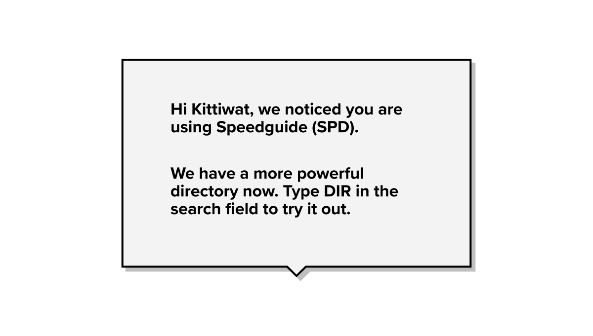
Personalisation data could be brought up to date.
Some users used the product on a profile that was not updated for many years, unaware of personalised functions.
Some users used the product on a profile that was not updated for many years, unaware of personalised functions.
Users want to help maintain data integrity
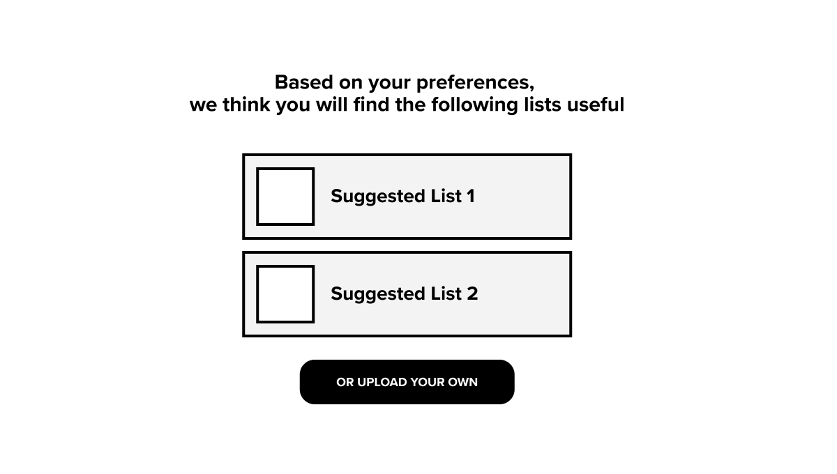
Users wanted tailored content and were flexible in their expectation.
Users appreciated the complexity and were open to measures that would maintain data integrity.
Users appreciated the complexity and were open to measures that would maintain data integrity.
Clarify rationale behind system complexity
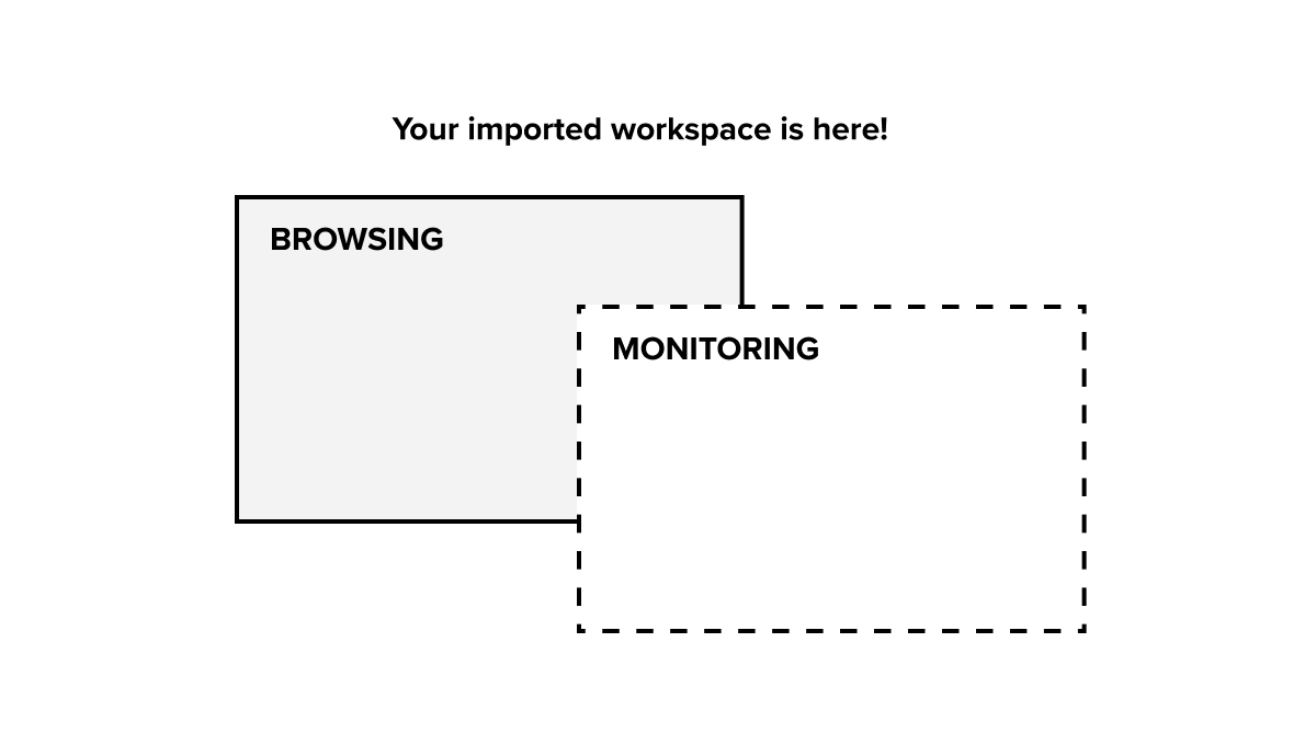
The need for different modes was not understood by users.
They were familiar with the idea, but felt this was duplicated in other functionality.
They were familiar with the idea, but felt this was duplicated in other functionality.
We also learnt about the value users had placed in their old interface.
Solutions for problem 1
Work on Onboarding had gathered pace and I set the direction of travel and executed the concept development.A few rapid design and testing cycles later, we had a successful candidate that solved the orientation and comprehension problem. Most of our users were now able to self-start and serve.
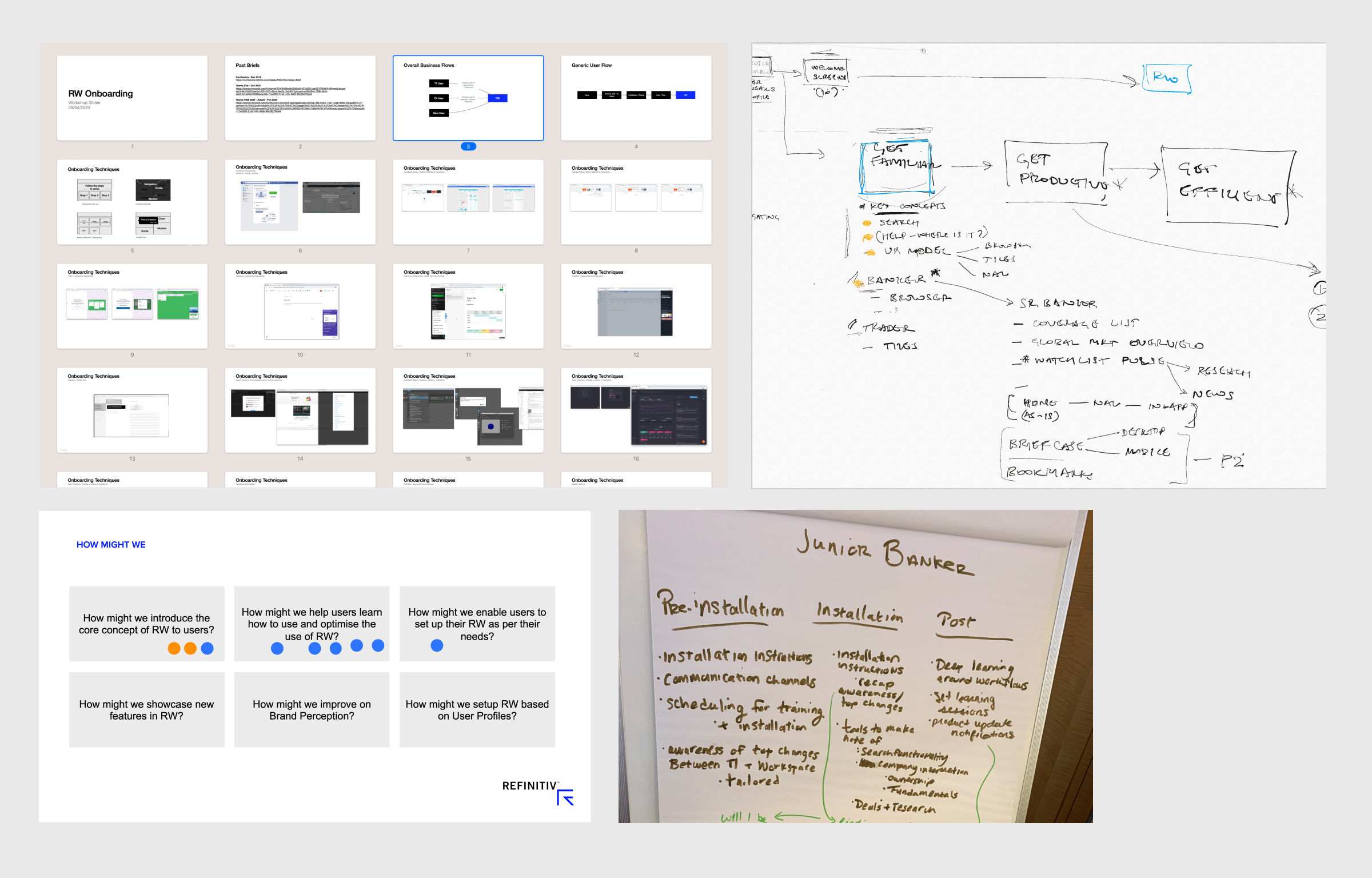
Discovery workshops and ideation
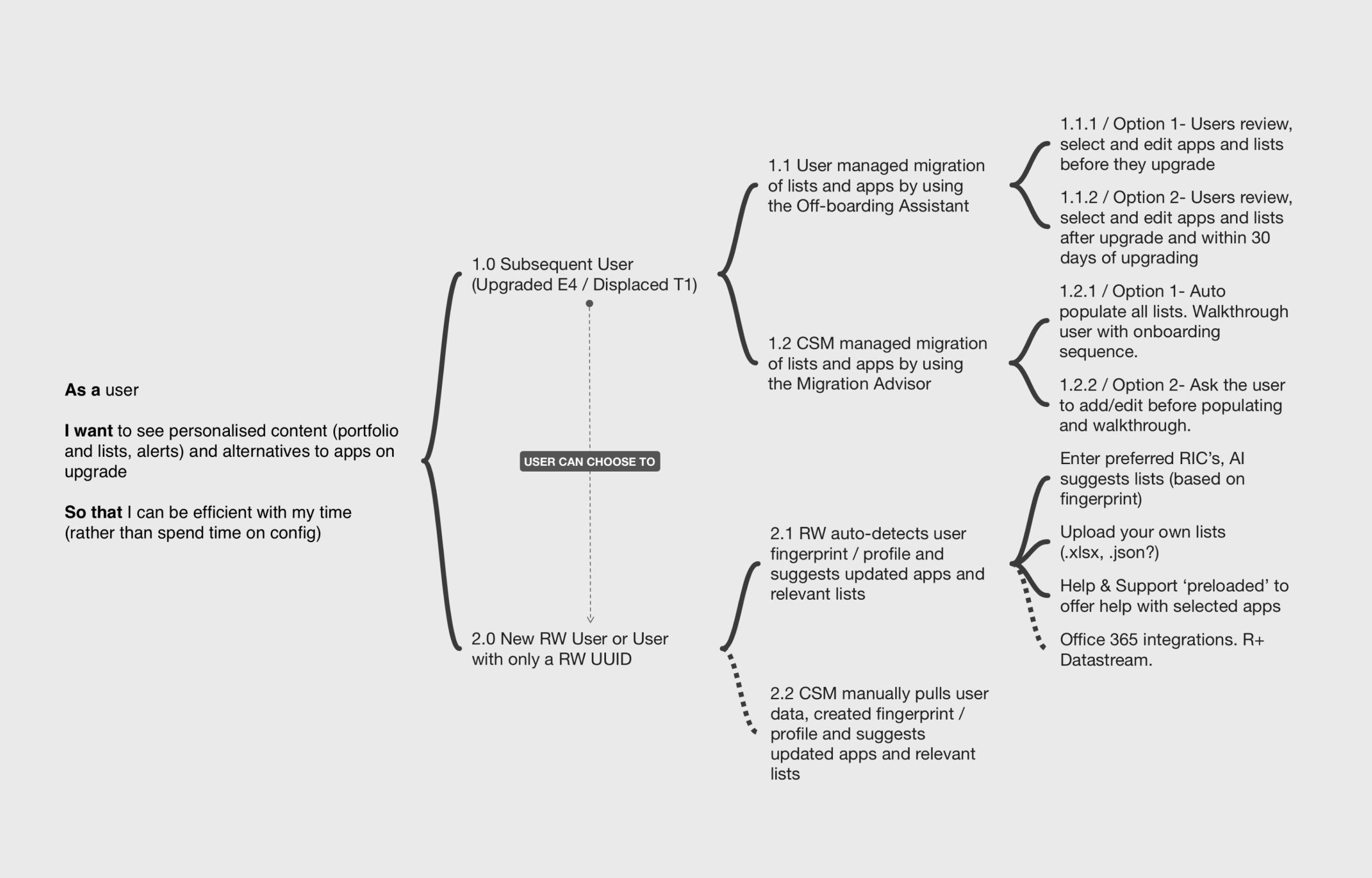
A typical user story to solution structure
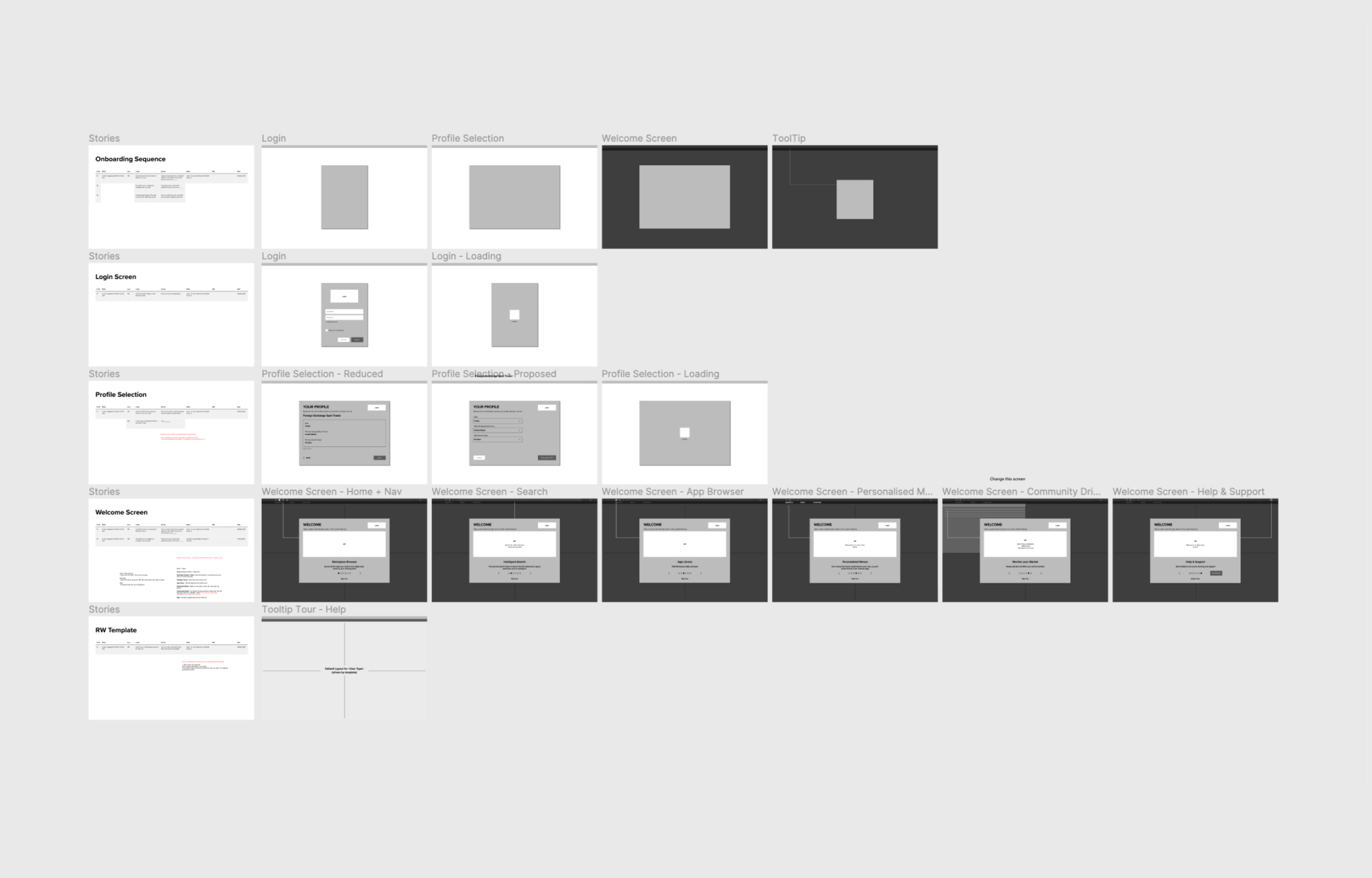
Onboarding - first release
Onboarding concept - second iteration
Solutions for problem 2
There was clearly a gap between a user's expectation and the product offering and I began to map the mental model of the user against the product's structure.I started out with unpacking the product anatomy—containers and content.
I then looked at the IA, navigation and menus, and charted out core workflows for our primary users.
Finally building the hierarchy of containers and content for the framework.
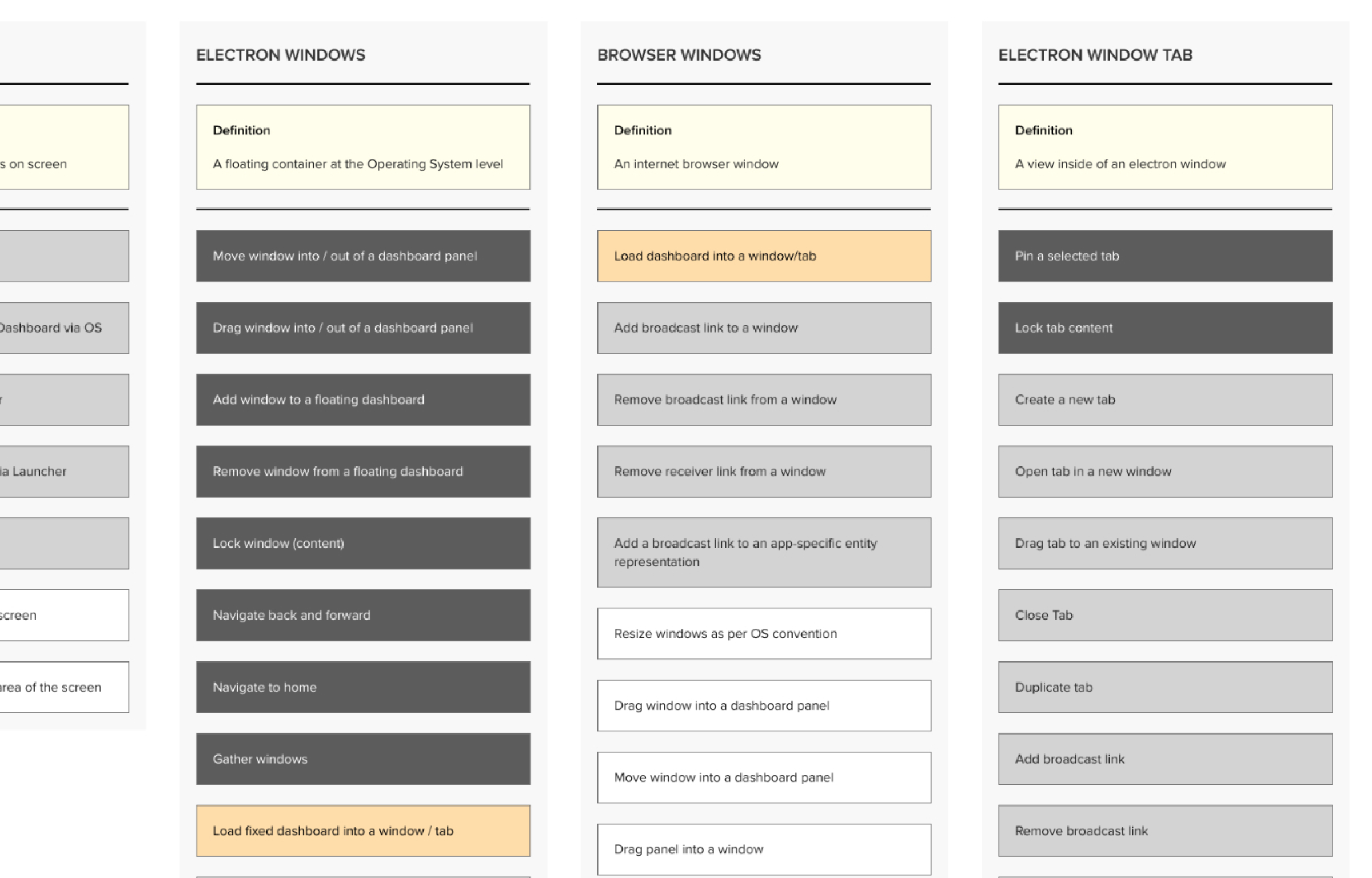
Documenting all containers and actions in workspace
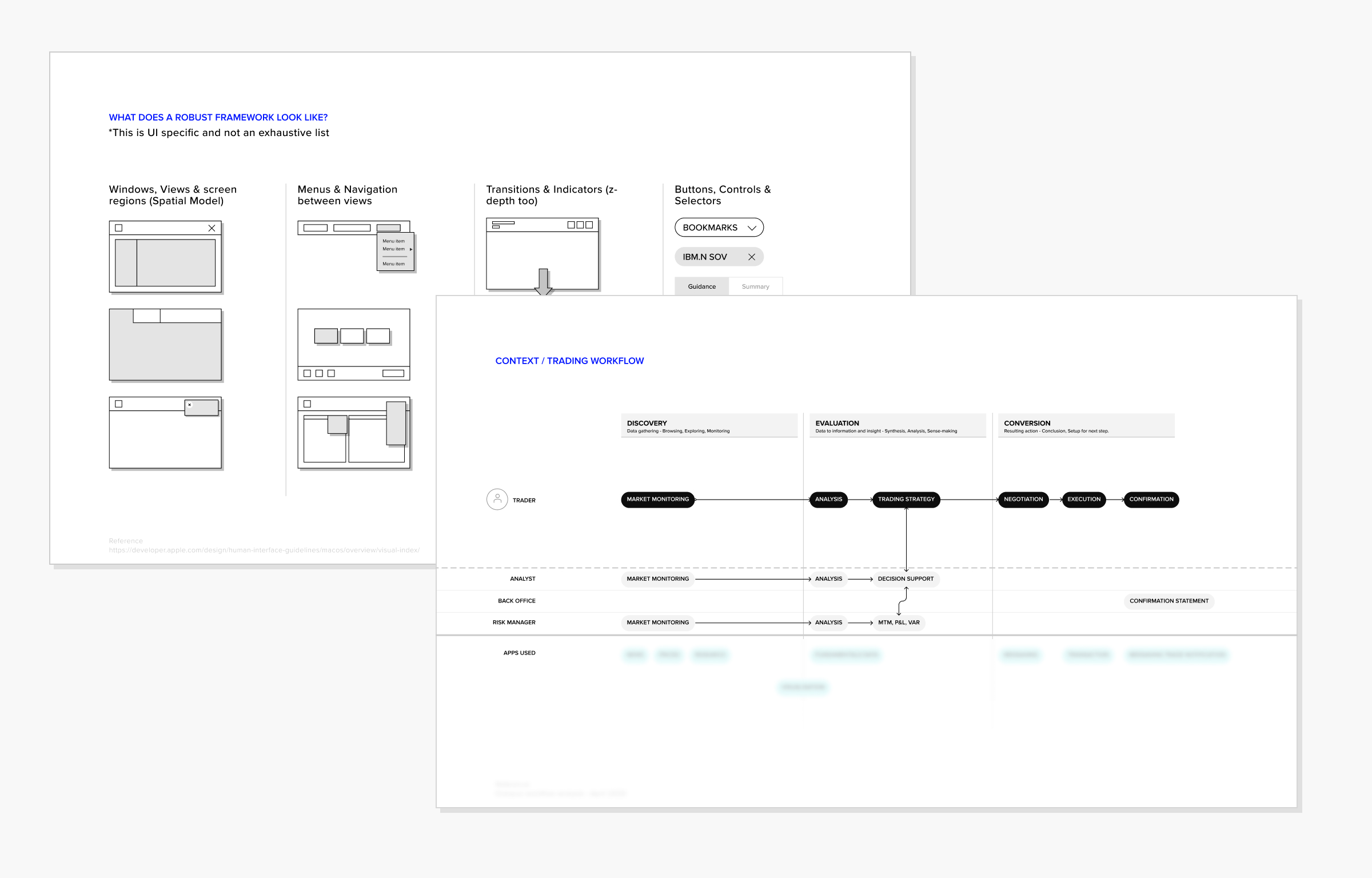
Workflow workshops
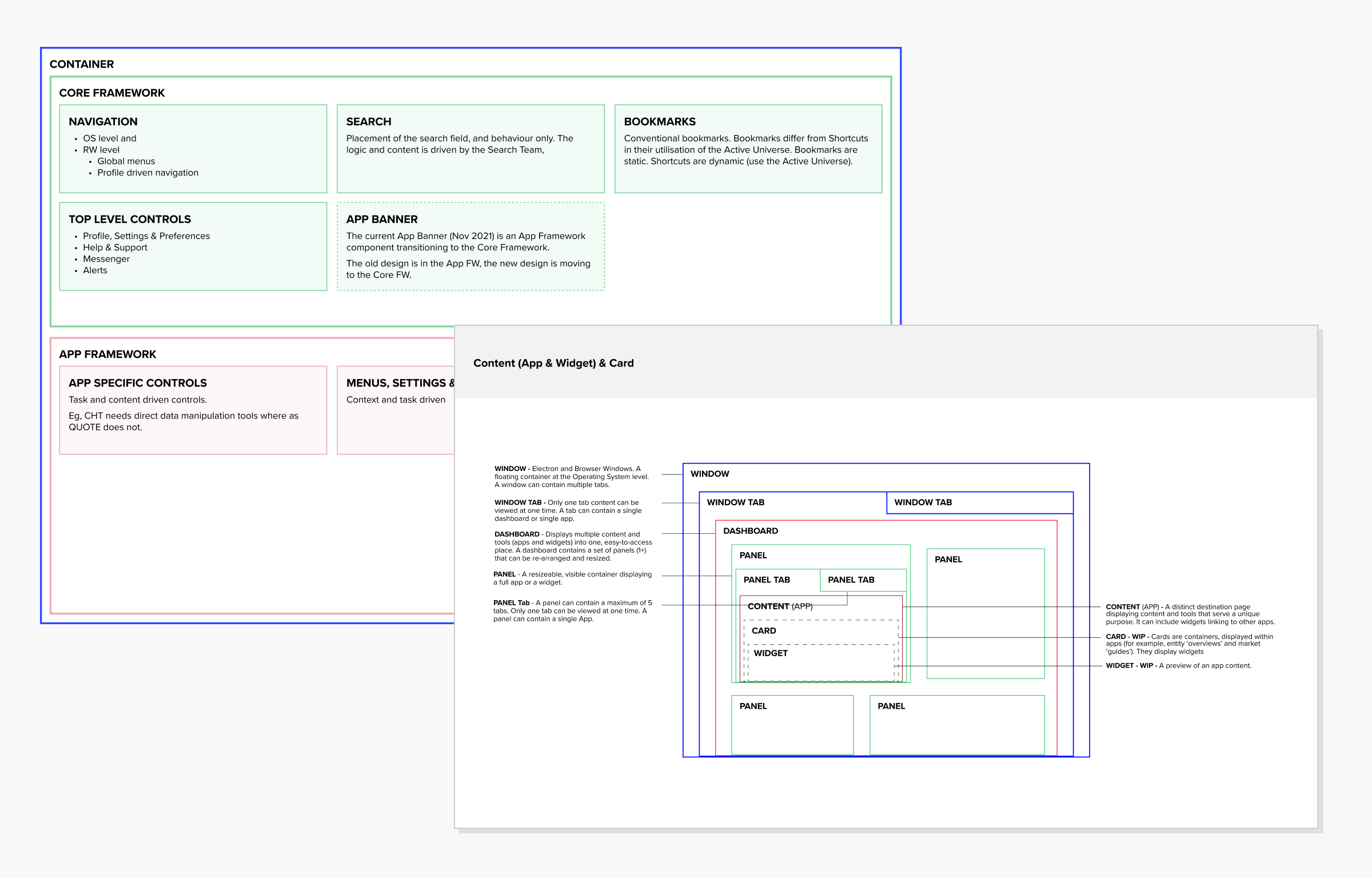
Framework Hierarchy
I also documented the design using code where appropriate. Especially when capturing content behaviour in various responsive states.
Electron prototype to demonstrate fluidity in responsive layouts
Electron prototype in a web container to demonstrate dynamic data changes