Schlumberger FDPlan
2019
Designing a digital ecosystem for the worlds largest oilfield infrastructure services company in the world.
Impact
Product Quality
Users reported predicability and low 'effort to learn' in way-finding. Product, Domain and Engineering teams developed alignment on key user journeys.
Time on task
Task completion rate increased and % detours and time on task, shortened.
Level AA
The design system matured to be WCAG level AA compliant and overall more robust.
Context
Schlumberger provides infrastructure data and support to the energy industry and their ambition was to be the market leader in the Energy industry, a focus wider than hydrocarbons.In 2018, the goal was to open access to their digital platform, Delfi, and to make it collaborative, live and transparent.
I led design on two Delfi products—Facility Plan and Field Development Plan (FDPlan).
What is Facility Plan?
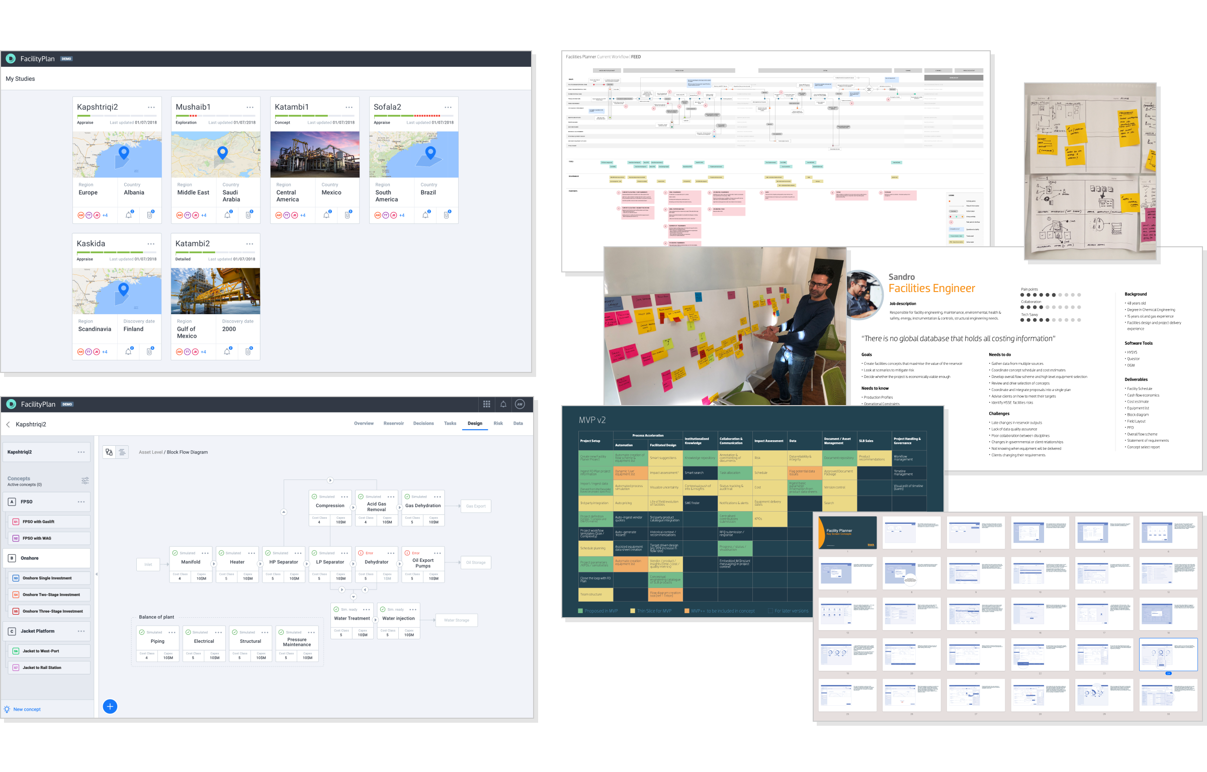
Facility Plan is a production site & equipment design and costing product. It helps Facility Engineers test and cost block flows with great accuracy.Its based on a deterministic model which can be used to create parameters and simulate chosen decisions.
Facility Plan
What did I do?
The focus of the project was to explore and define the impact that this tool can have in the larger ecosystem.Through the Discovery phase, I led research in order to define As-Is and To-Be workflows, scenario creation, persona refinement. I led design discovery workshops with the stakeholders, defining and storyboarding key user flows, culminating in an interactive prototype of the MVP.
Facility Planner, as its now known, is a freestanding tool on Delfi.
What is FDPlan?
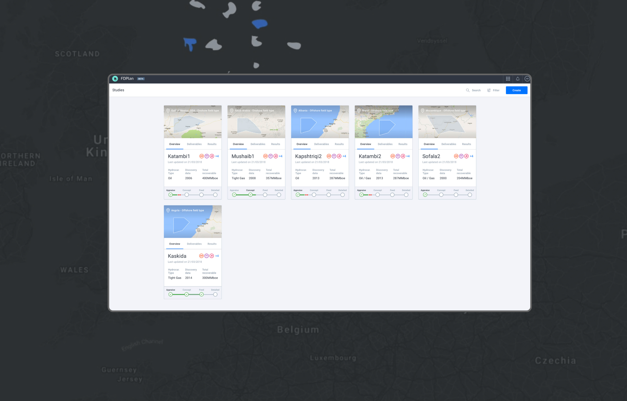
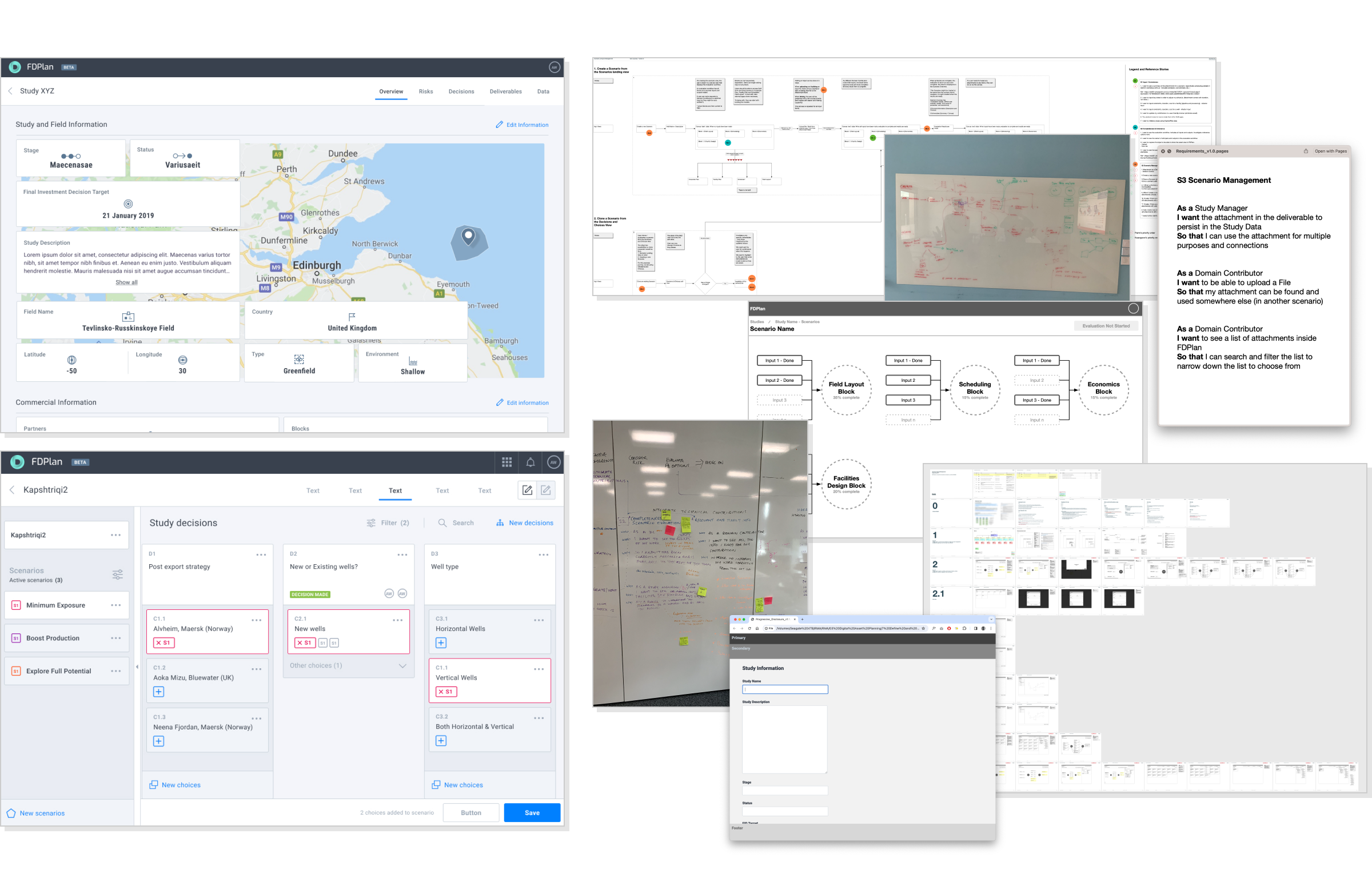
Field Development Plan (FDPlan) is a tool that drives decision quality.Study Managers use FDPlan to collect data, frame opportunities, weigh the risk of chosen decisions.
FDPlan is based on a probabilistic model and users plan, cost and estimate a range of scenarios before committing to any direction.
FDPlan
What did I do?
FDPlan was well into delivery when I joined the team. I looked after the areas of Scenario Lifecycle Management, Study Overview, Decisions & Choices and Notifications.Through the time I worked on the product, I refined the spatial and framework concepts of the product, the data interoperability model as well as multiple UI components and patterns.
Below is the story of how I refined a very specific problem with the navigation.
The problem with navigation
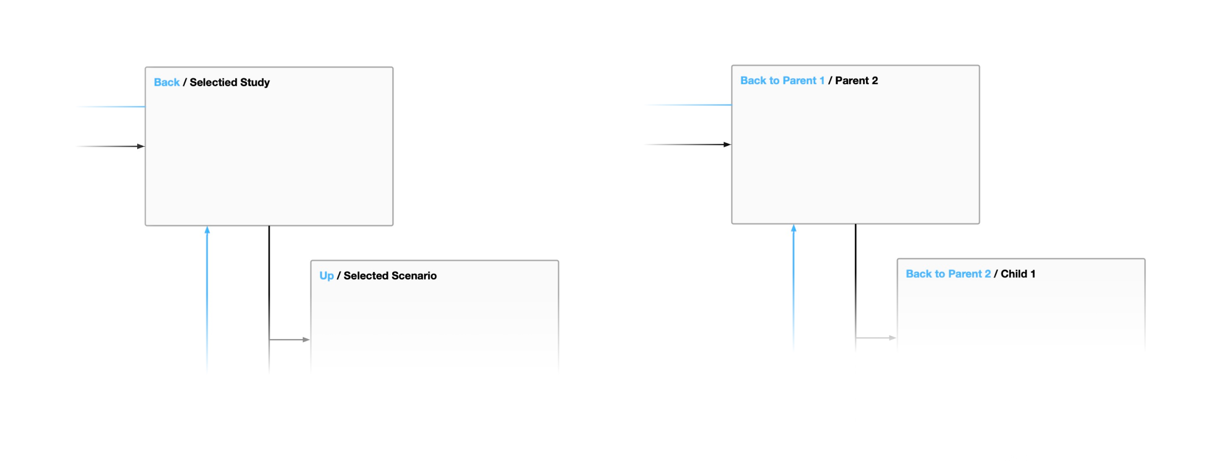
FDPlan is a web app and is delivered via a web browser. The chevron icon in the nav bar of the app would often get confused with the back arrow of the web browser. This led to users often moving a step backwards in history, when they meant to move up into the hierachy.
The chevron problem
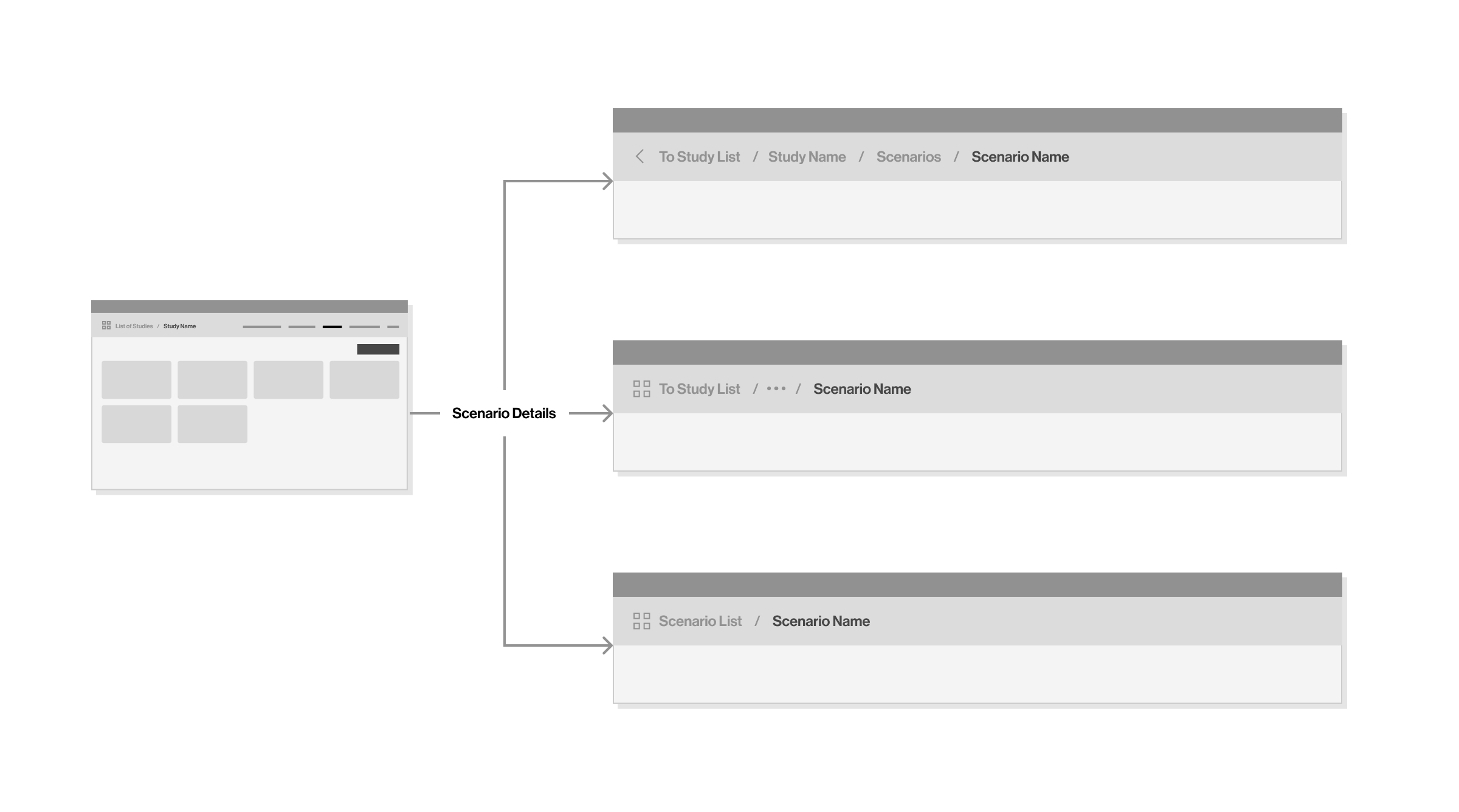
FDPlan has a polyhierarchical structure and it was important that users could access the data from multiple routes without losing their bearing.
"I need to review the same decisions from either context. (via a Study or via a Scenario)"
Study Manager
"Why doesn't it (the back chevron) take me back?"
Domain Contributor
Unpacking the problem
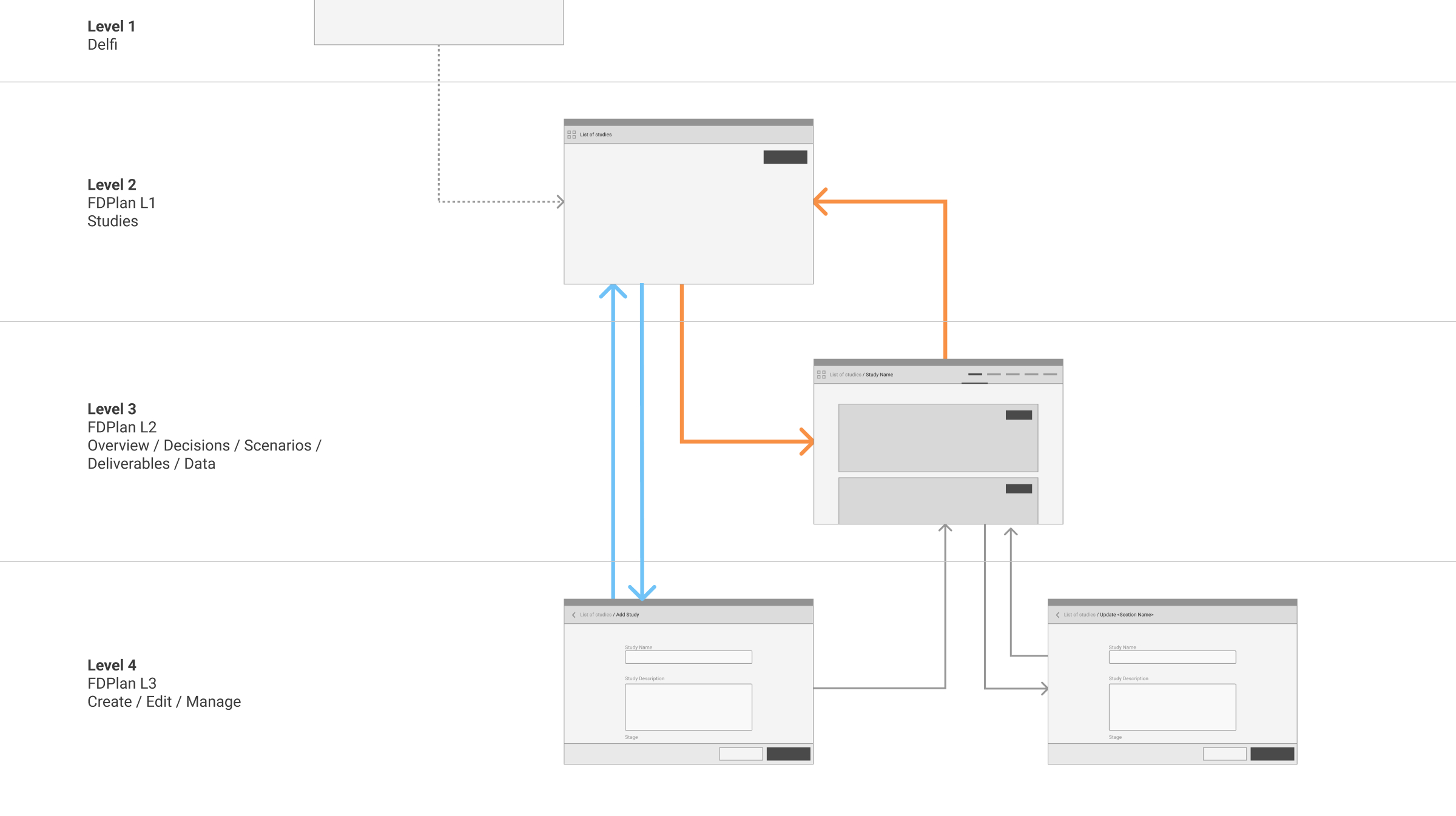
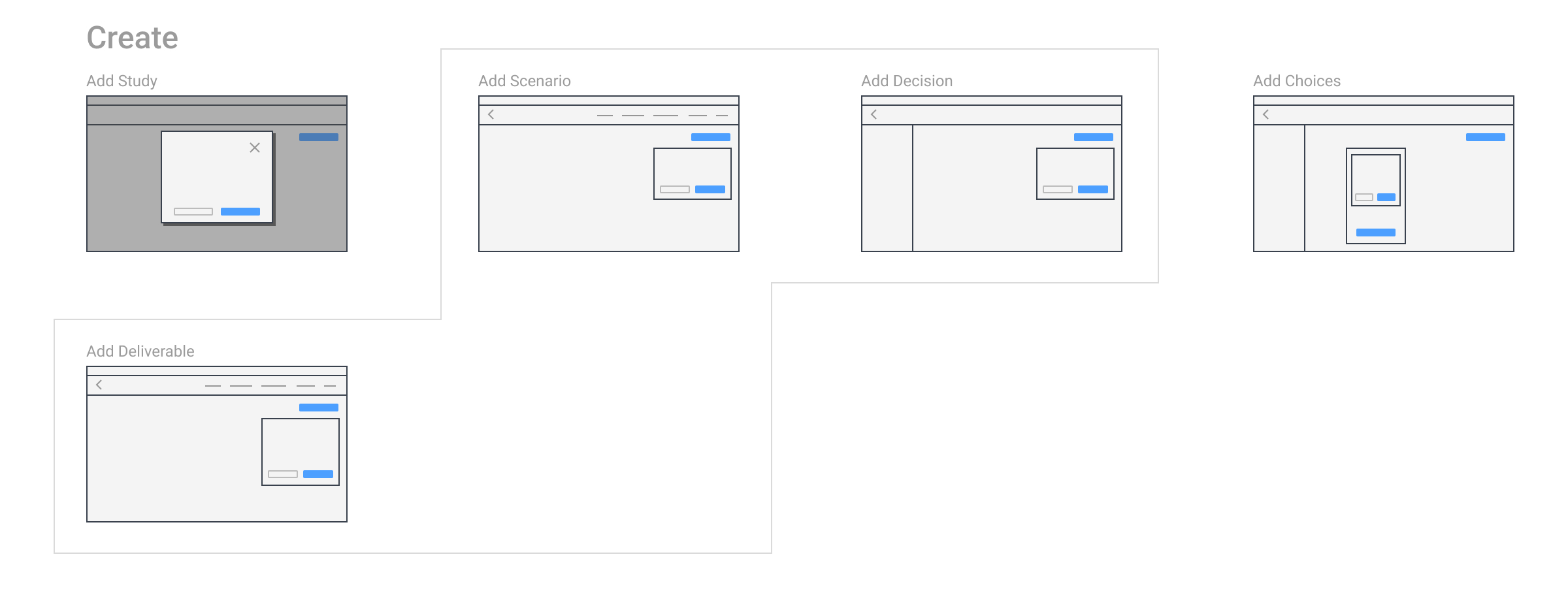
I documented the hierarchy, levels and Main IA of the product and the platform.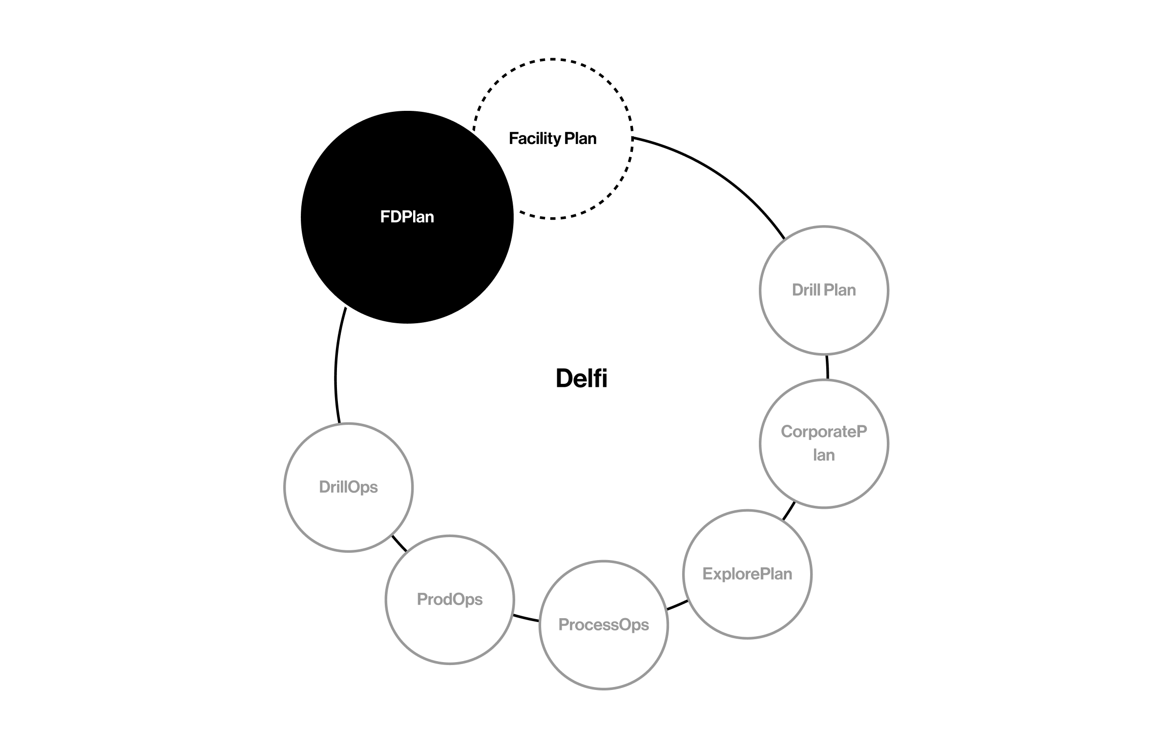
Delfi platform products
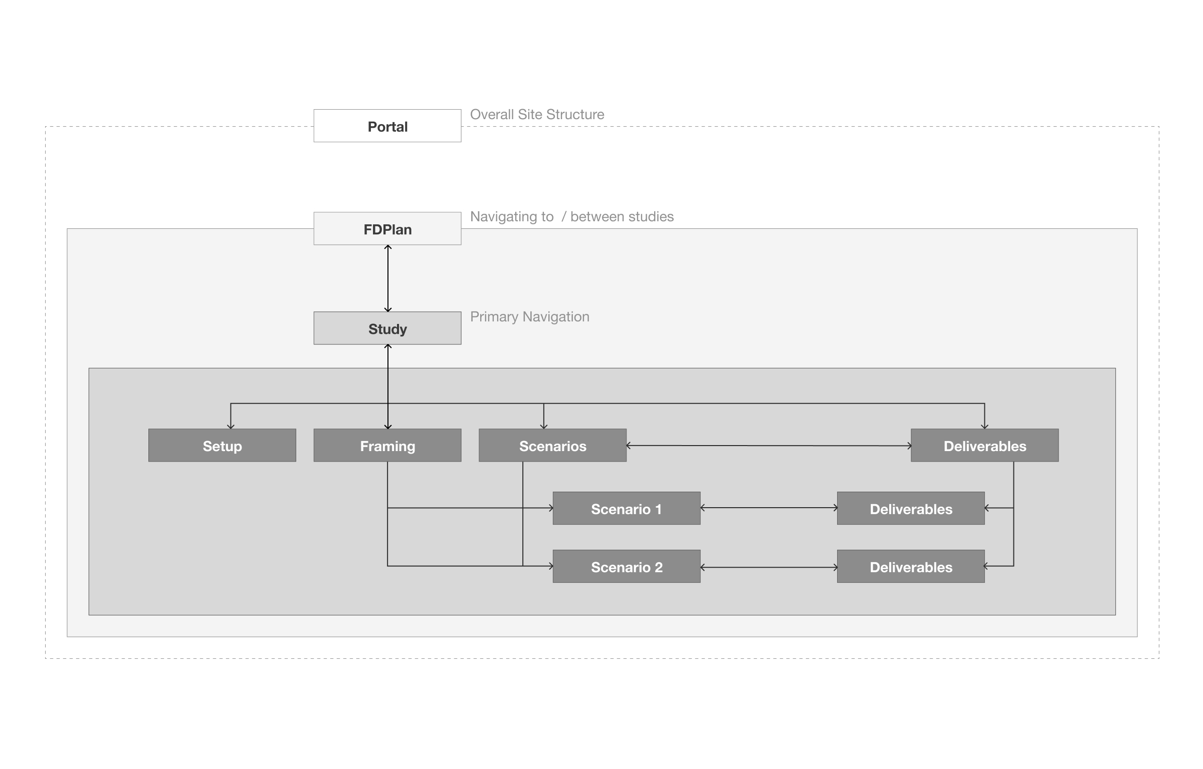
Delfi platform hierarchy
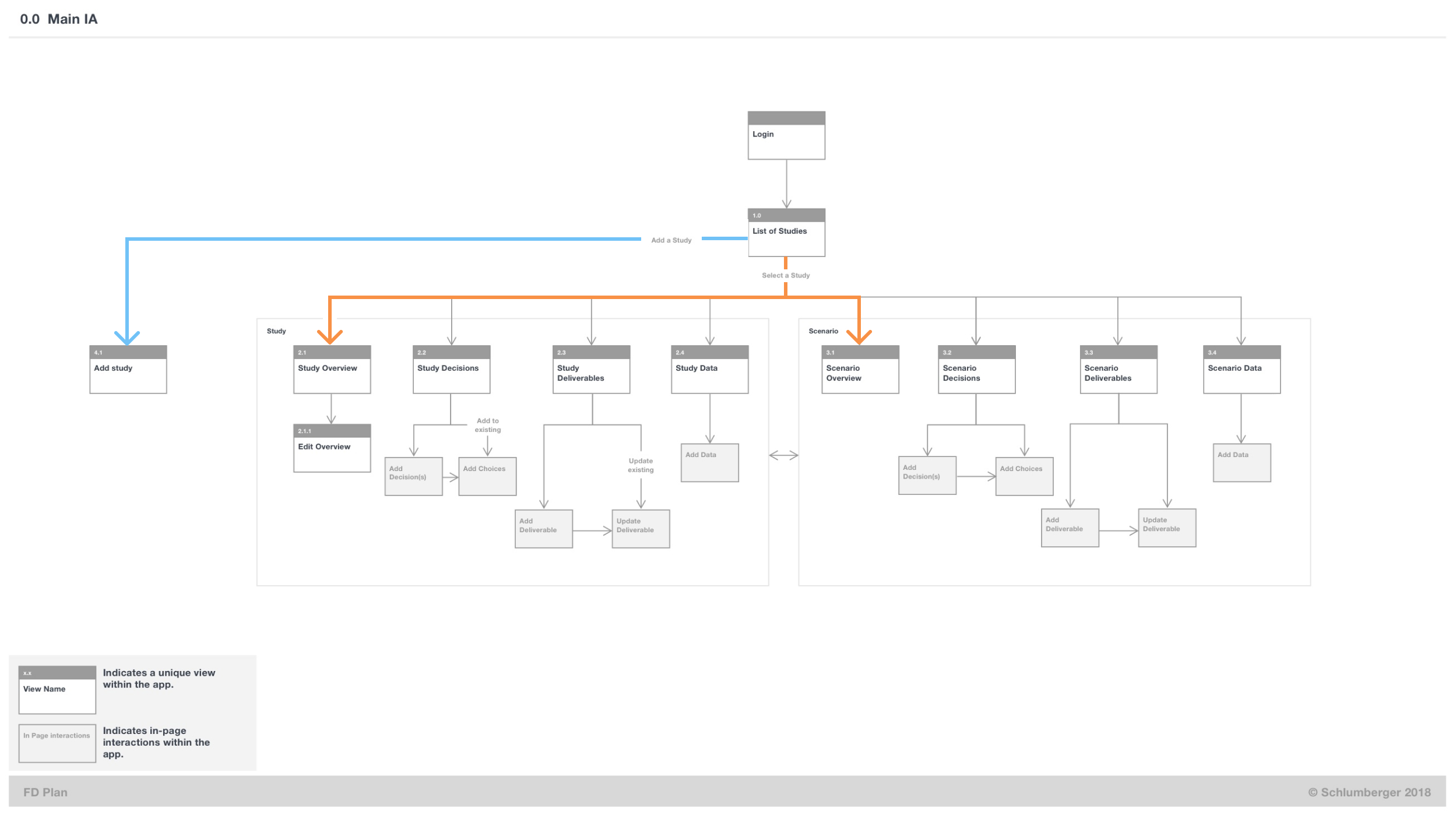
FDPlan Main IA with key journeys highlighted
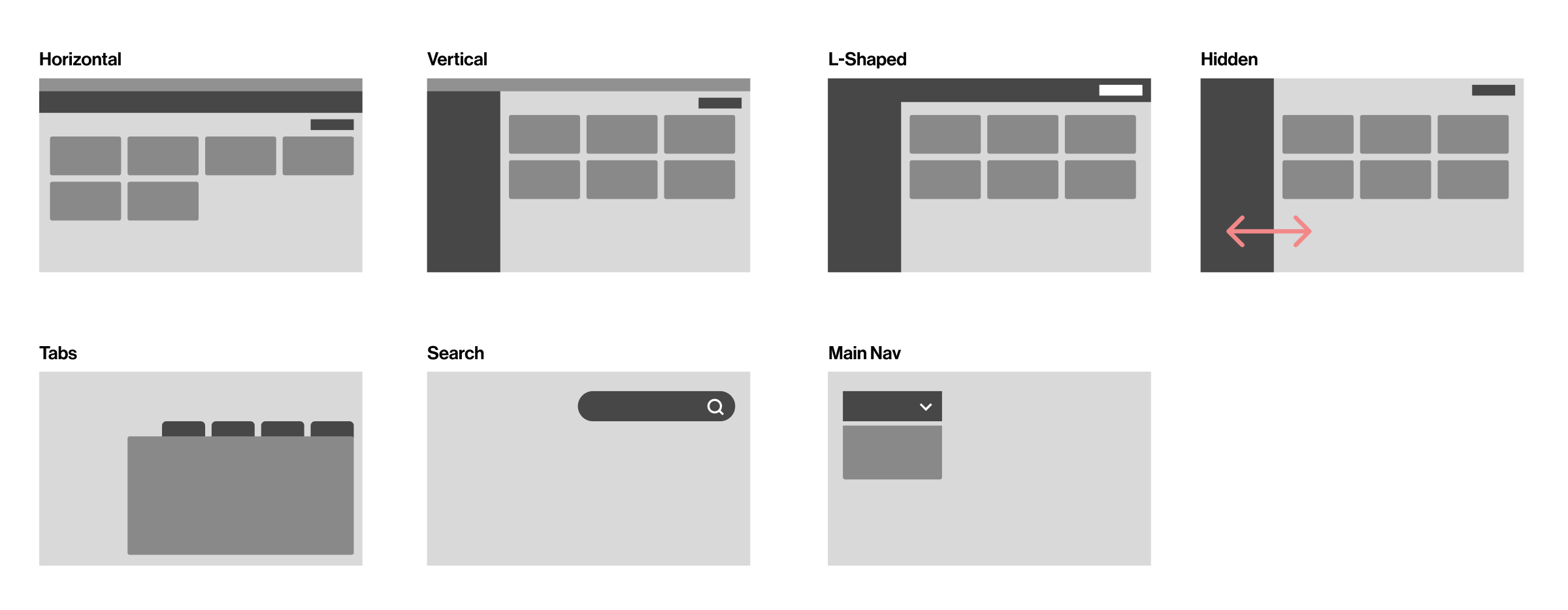
Followed by collecting navigation pattern types that could be appropriate to the product, and exploring design options.
Solving the problem
Defining the key journeys (frequency and intensity), the key activities as well as the patterns that would be a natural extension to the product, a header design began to emerge.Resulting in concepts that I could develop further.
I explored a range of options rapidly with real data for character length, keeping in mind affordance and accessibility.
I prototyped 14 different options in html/css. A few of the ideas are below.
I prototyped 14 different options in html/css. A few of the ideas are below.
Concept 2 - Progressive menu
Concept 4 - Visible breadcrumbs hierarchy and labels, flat
Concept 5 - Sliding nav bar with breadcrumbs and labels
And 3 rounds of testing later, we had a development candidate.
The final version of the nav
Reflections
This 4 week focussed effort to fix the navigation had a substantial pay-off over the course of the product development.Field Engineers have a business responsibility to respond to market changes. FDPlan helped with bringing down mega-project fail rate*. From 80% down to 30%.
*A failed project is 25% over budget or if it misses production targets for the first 2 years.
